Enhancing creative arts & crafts classes as well as third place discovery in New York City
With the rise of 'third places' as a popular concept, Akin is aiming to provide busy people lots of options where they can be creative, social and find new places to thrive outside of work and home. Akin is a mobile app that connects users to local arts & crafts classes while also helping them discover third places in their city. The project was a 6-month end-to-end design process from research to final prototype.
Try the prototype →Many platforms exist but they are either too niche, outdated, or not focused on the creative arts space. At the same time, the concept of 'third places' — social environments beyond home and work — is gaining popularity, but there is no dedicated platform to find them.
Akin addresses both needs in one app: discover creative classes and meaningful third places, all in one seamless experience.
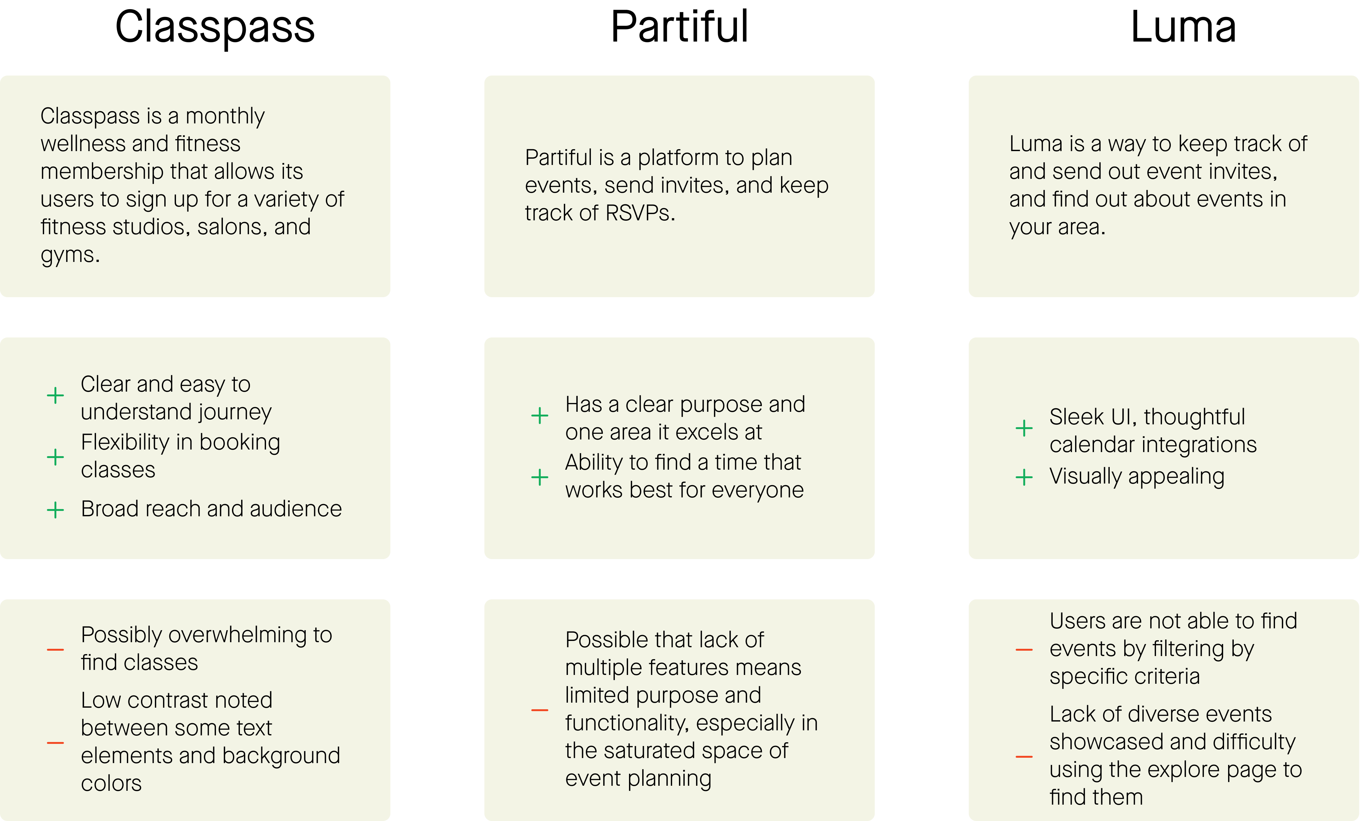
I needed to get to know the challenges and existing landscape of this space, so I conducted a competitive SWOT analysis. It felt like there were quite a few existing platforms that operate today in a similar fashion to what the Akin founders were thinking of. I wanted to focus particularly on any gaps, and what Akin could do that felt different.

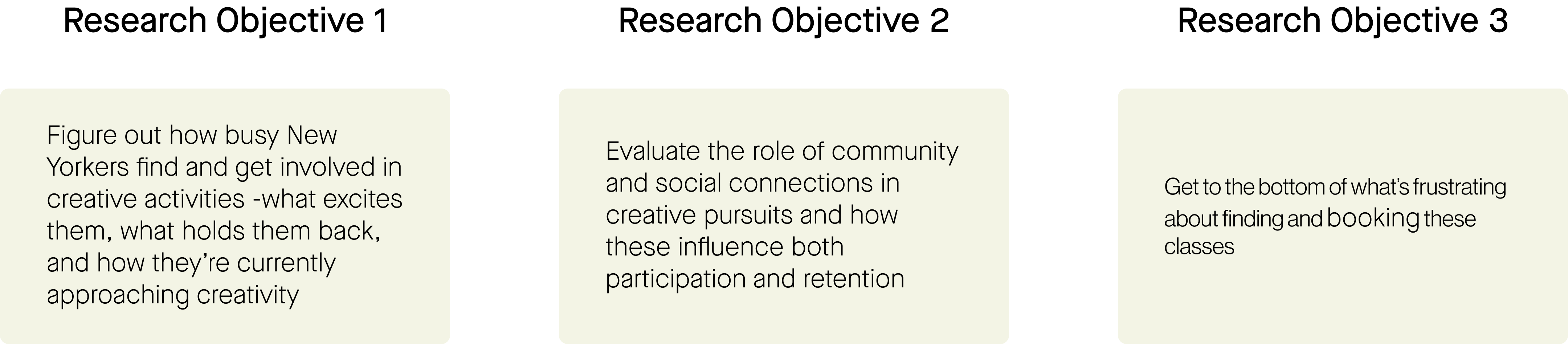
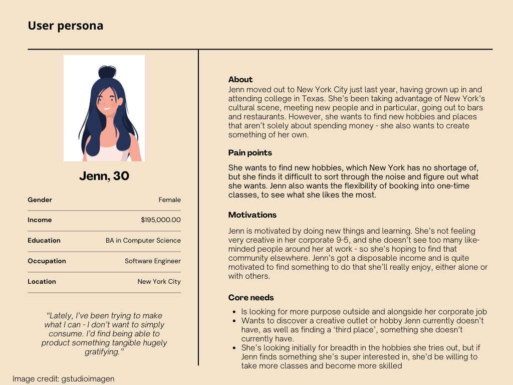
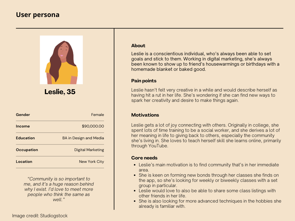
We spoke to 5 people in moderated user interviews, namely to uncover what roles hobbies have in people's lives and how they find them, and what makes them and other forms of community fulfilling.
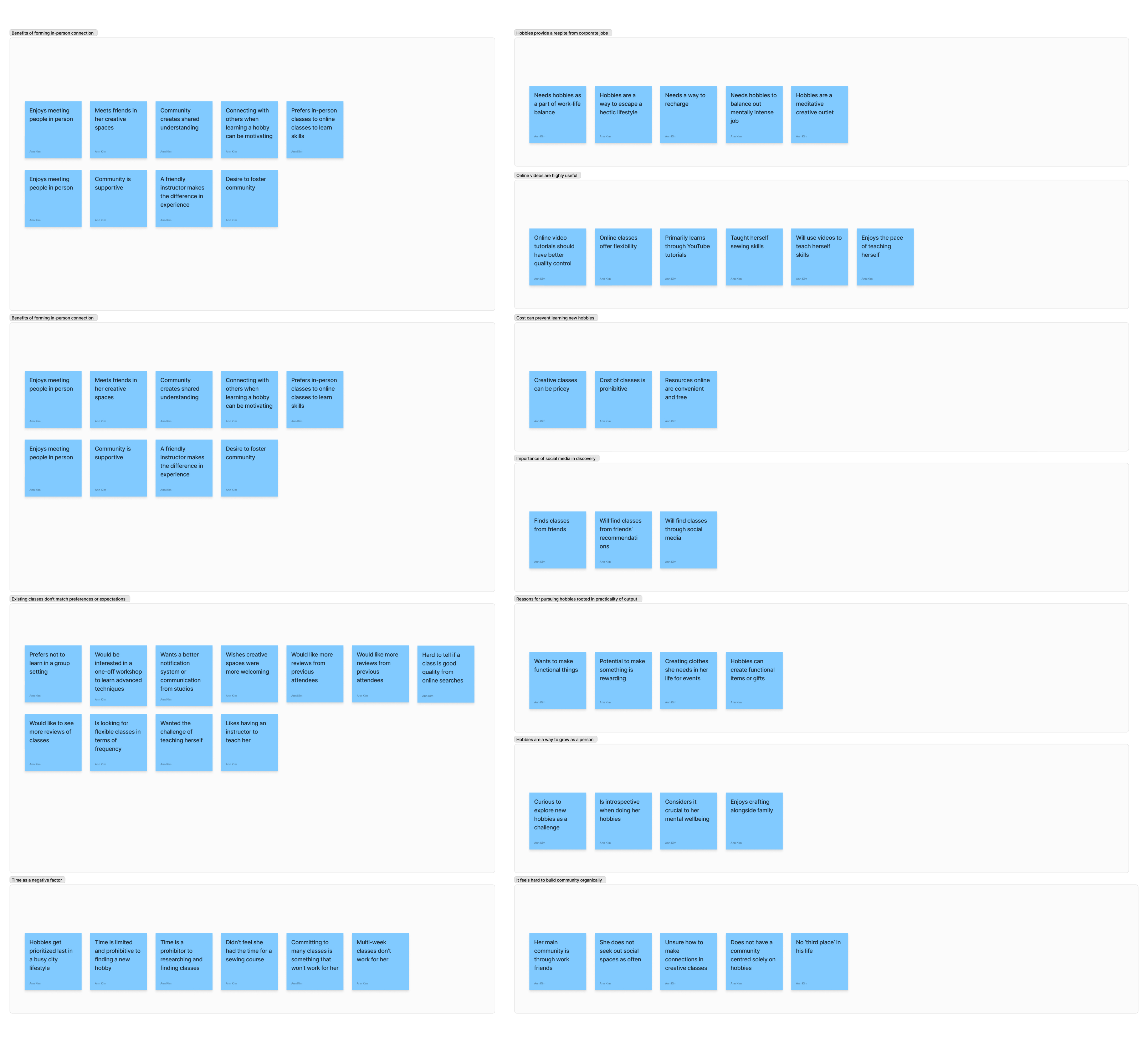
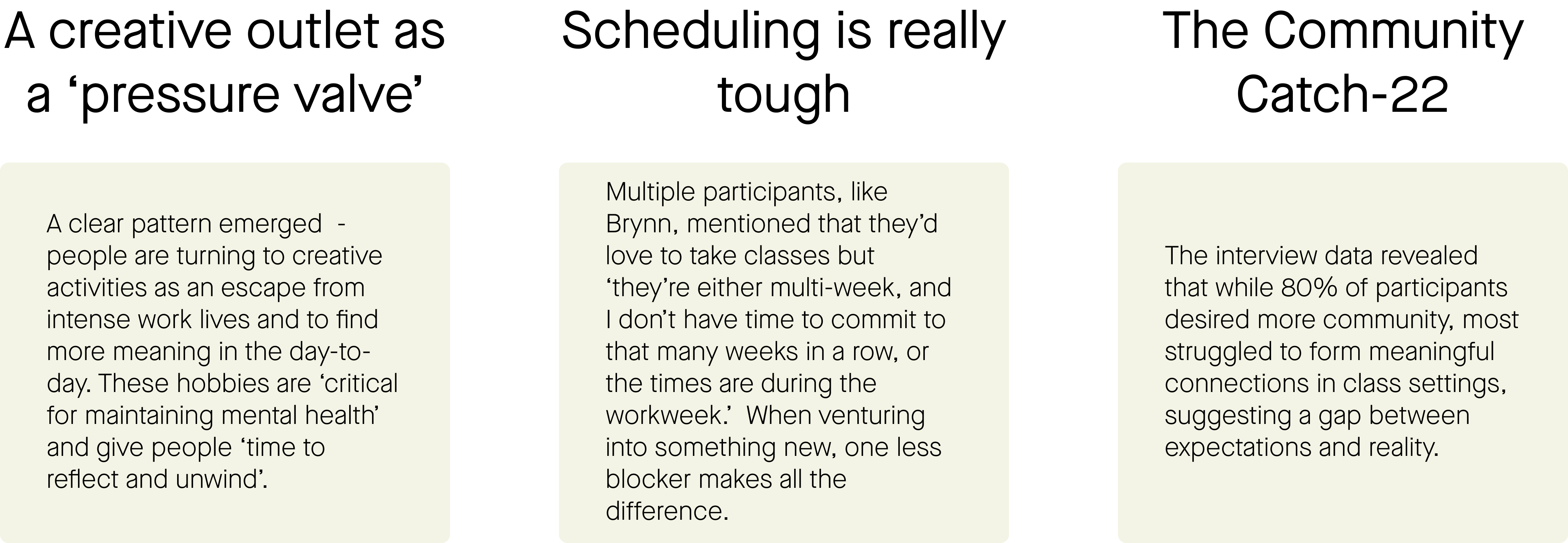
There's an overall sense of overwhelm and not being sure where to get started, from my conversations with the participants. Community-building isn't so simple within just attending a third space either. A participant who has attended sewing classes previously said, "There's different personalities, and if everyone had that mentality [of fostering more friendliness and community] then it would be different. But I don't know how to foster that either."
From our research we identified three core user types: the social explorer, the skill-builder, and the community host. Each has distinct motivations and pain points that shaped our design decisions.
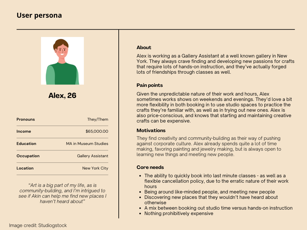
How might we help working professionals in New York feel more creative, fulfilled, and connected to their community?
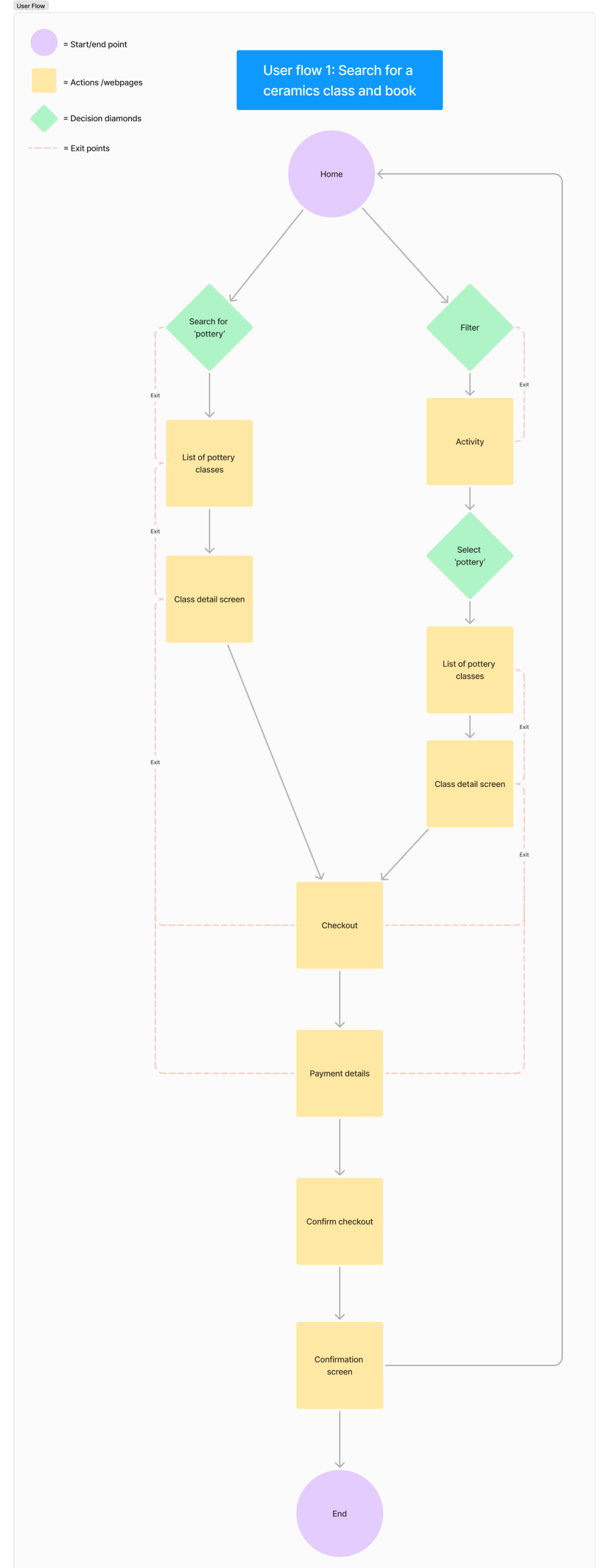
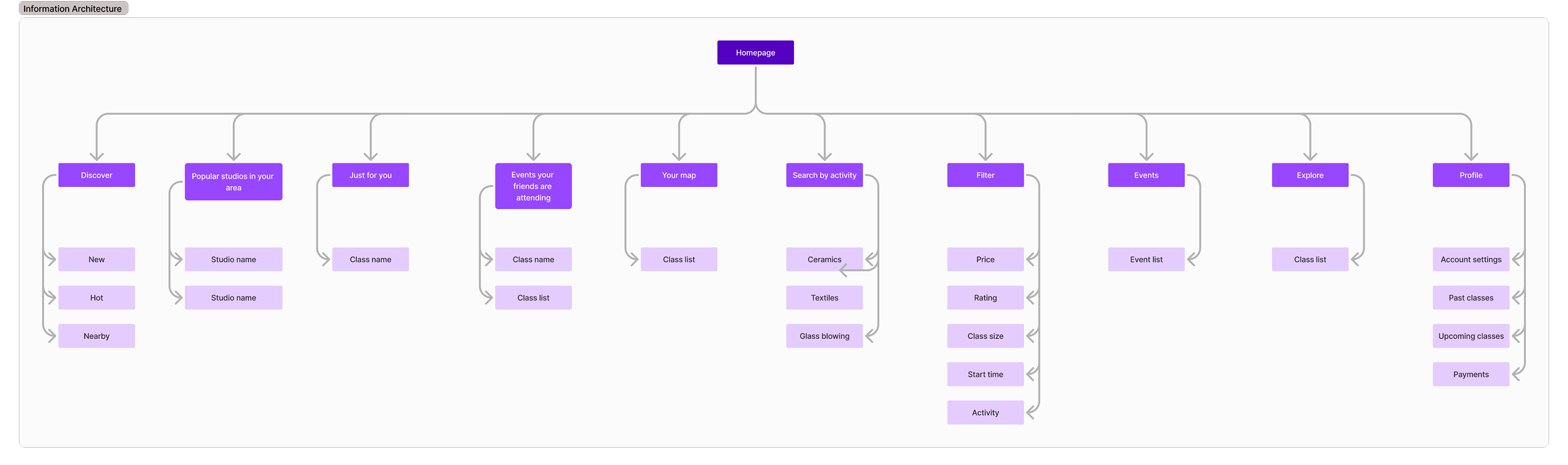
With a more solid understanding of user needs and pain points, and a 'How Might We' statement in place to work with, we were able to start thinking about user flows and information architecture.
We explored various approaches, including:
While considering key challenges, which we encountered early on (and continue to wrestle with):
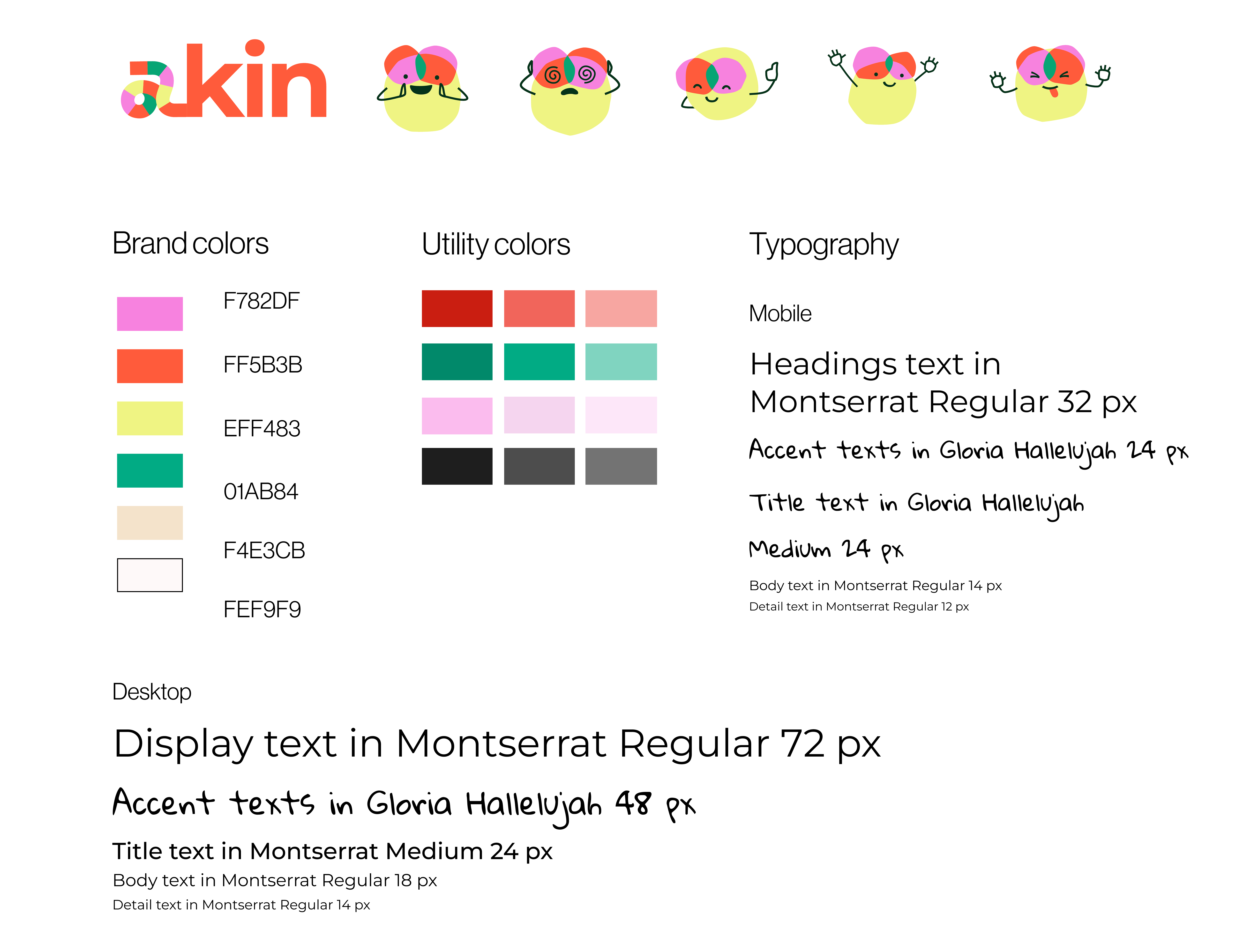
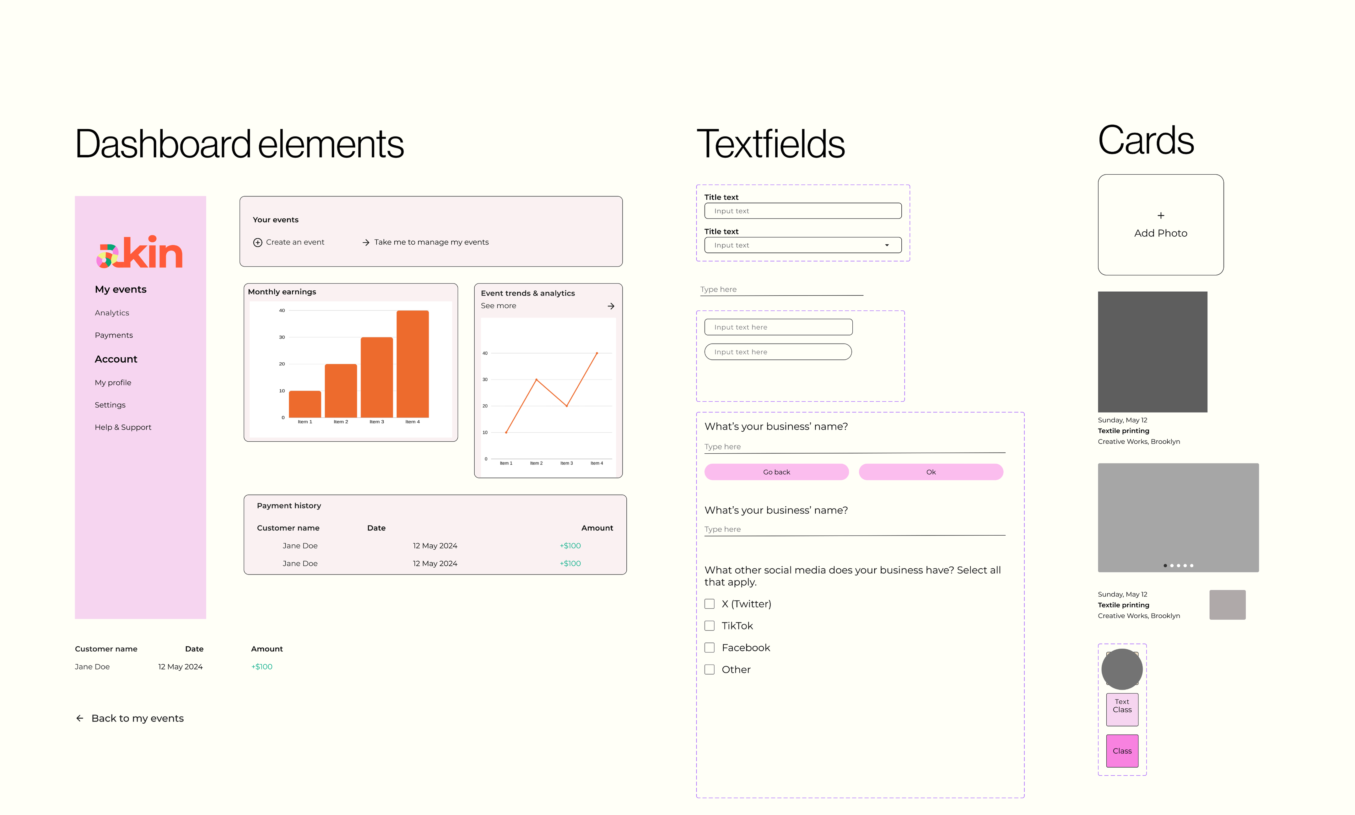
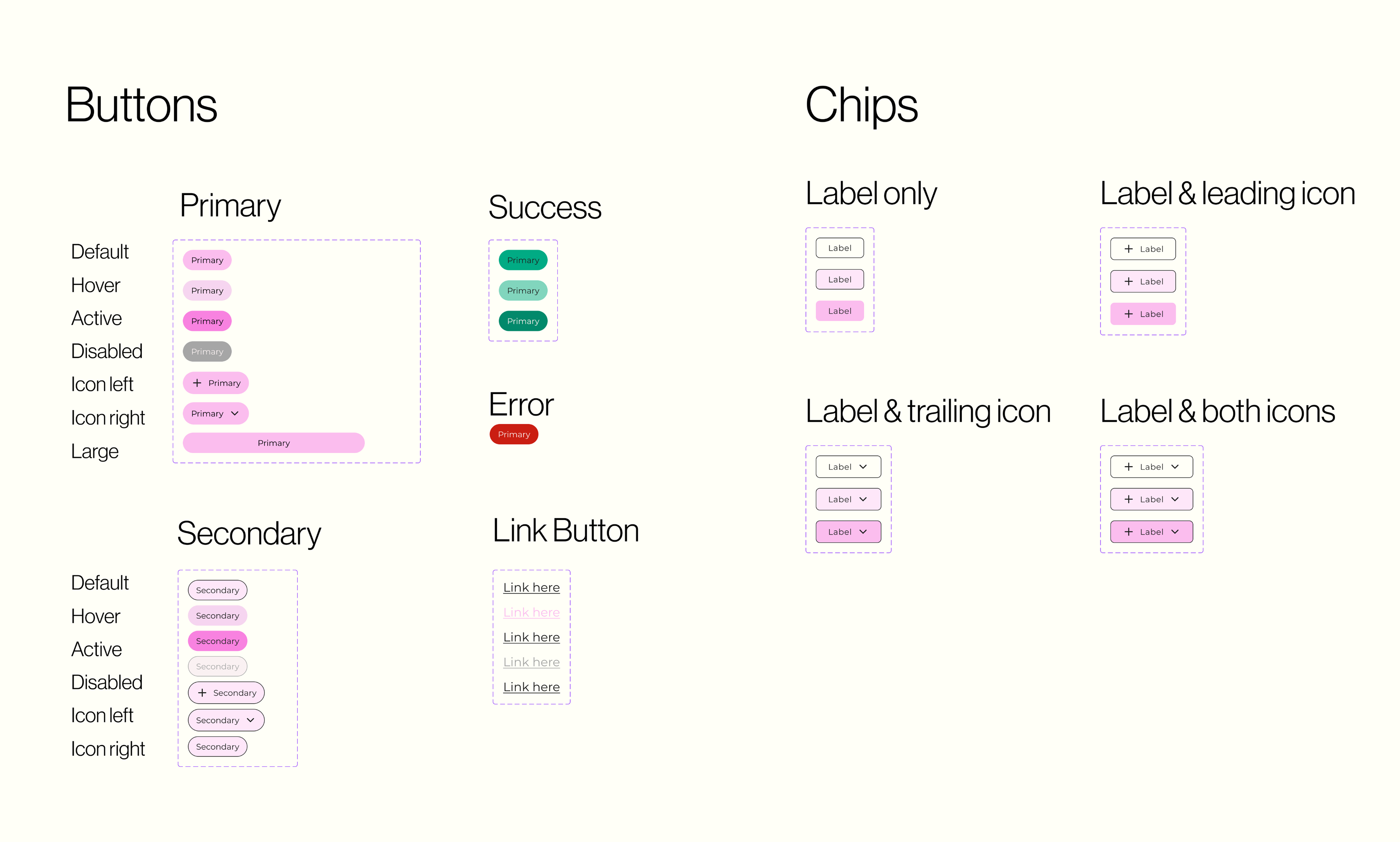
A wonderful graphic designer created the branding, logos, and colors for the overall look and feel of the brand. I took this work into developing utility colors, use cases for these and the typography, as well as a component library for icons, buttons, and re-used components such as menu bars and cards.
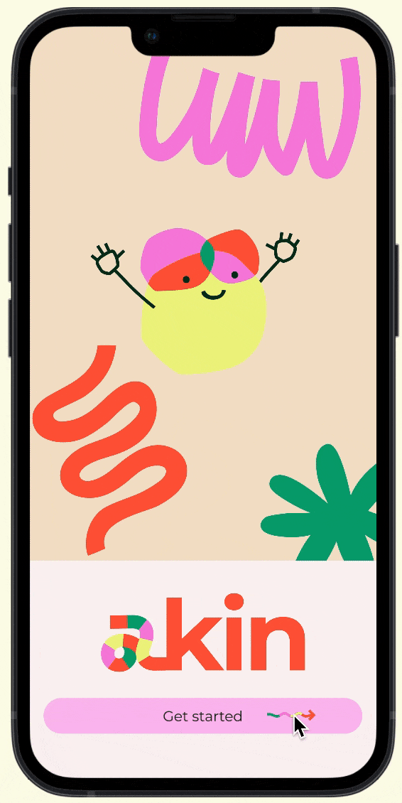
Akin's visual identity uses a warm, playful palette anchored in the brand's identity. We built a comprehensive component library to ensure consistency across all app screens — from colour tokens and typography through to interactive states.
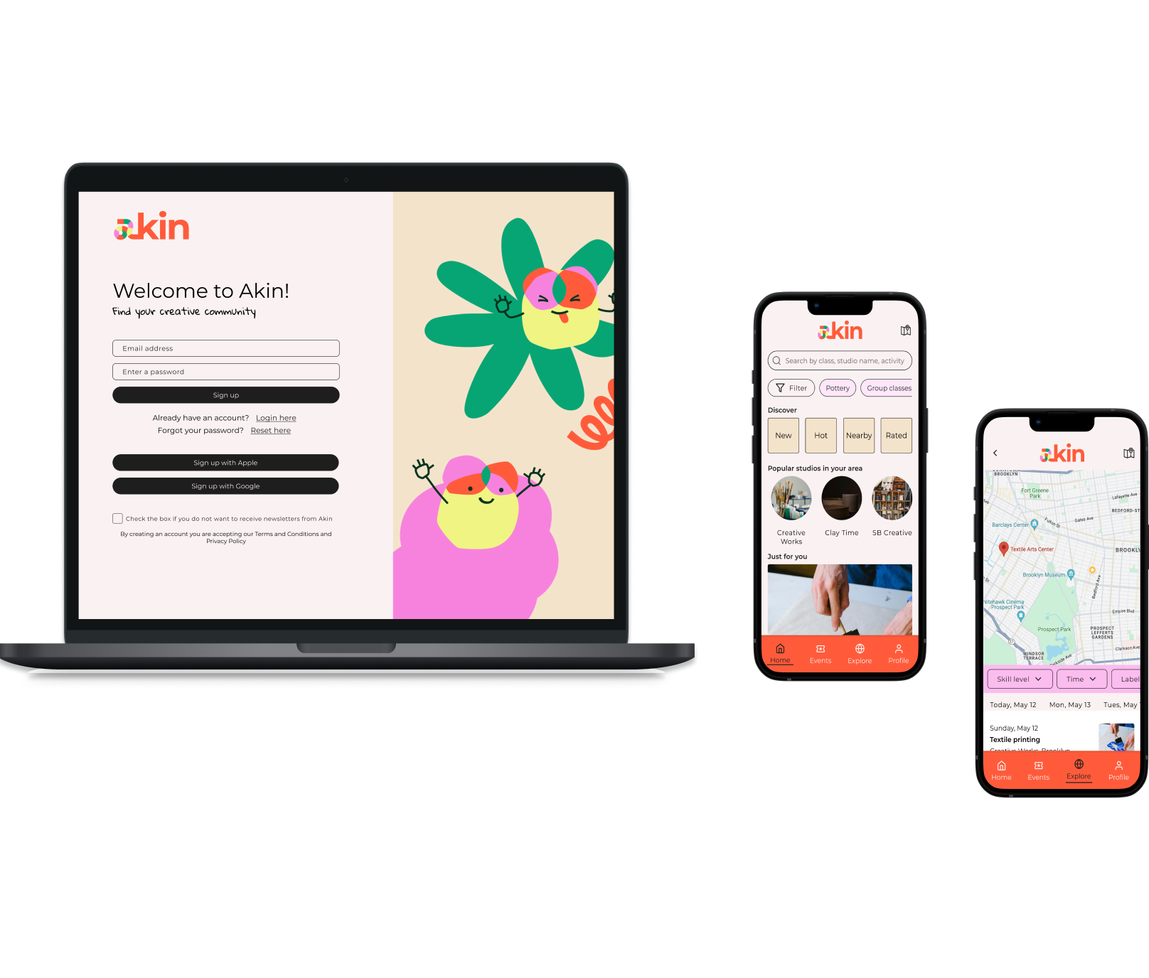
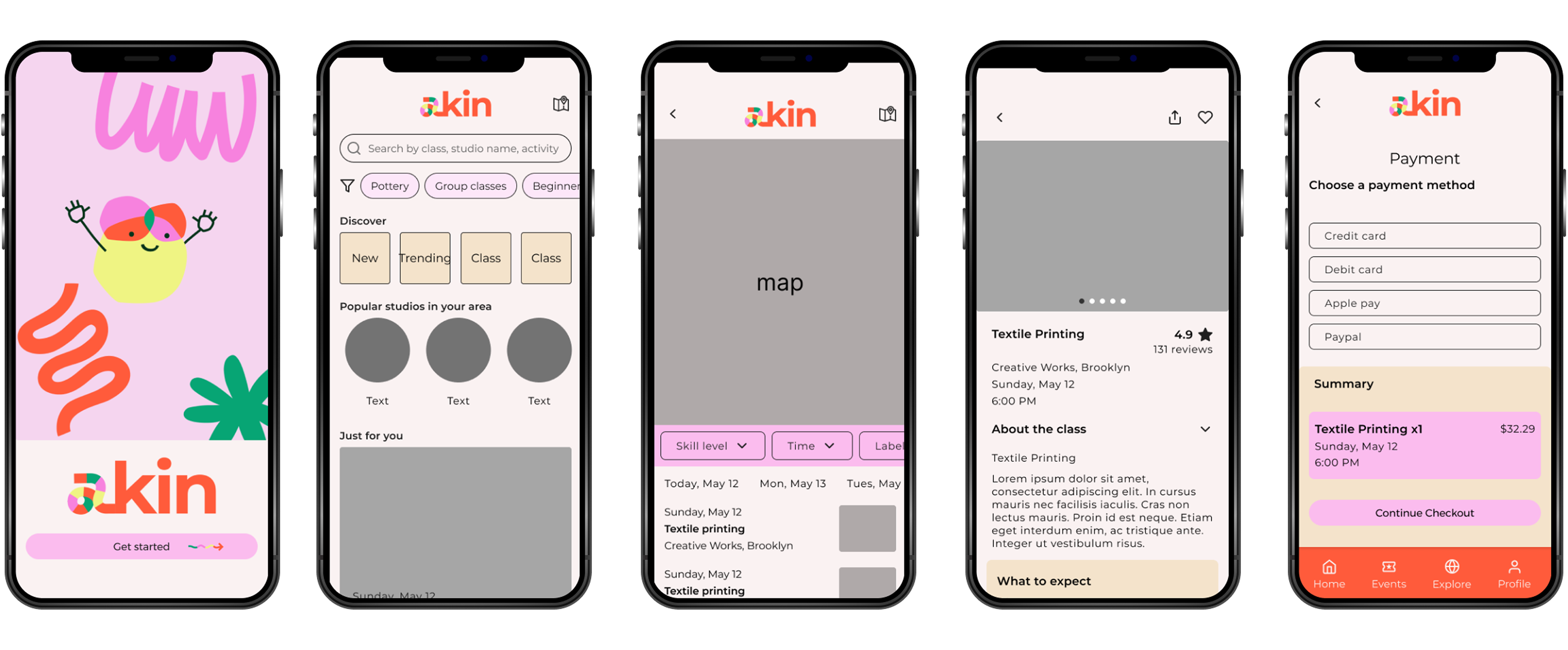
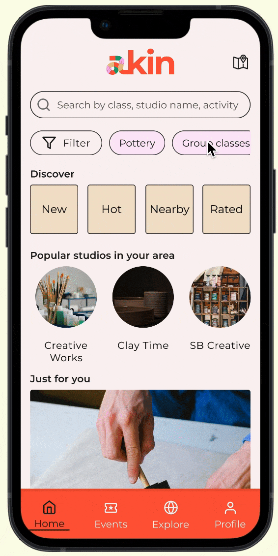
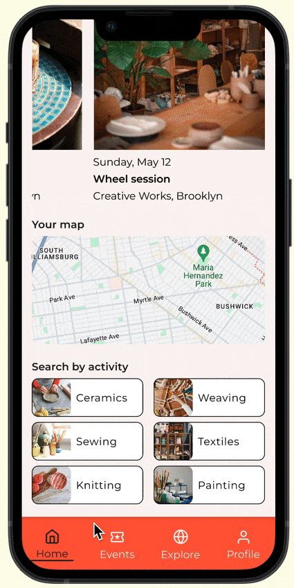
We created user flows, low-fidelity wireframes, and iterated through three rounds of usability testing before arriving at the high-fidelity designs. Key flows include onboarding, class discovery with filters, booking, and the community map.
After an initial round of testing with the mid-fidelity wireframes above, I set up usability tests with Maze. 9 people ended up taking this unmoderated test, with 2 main task flows to complete:
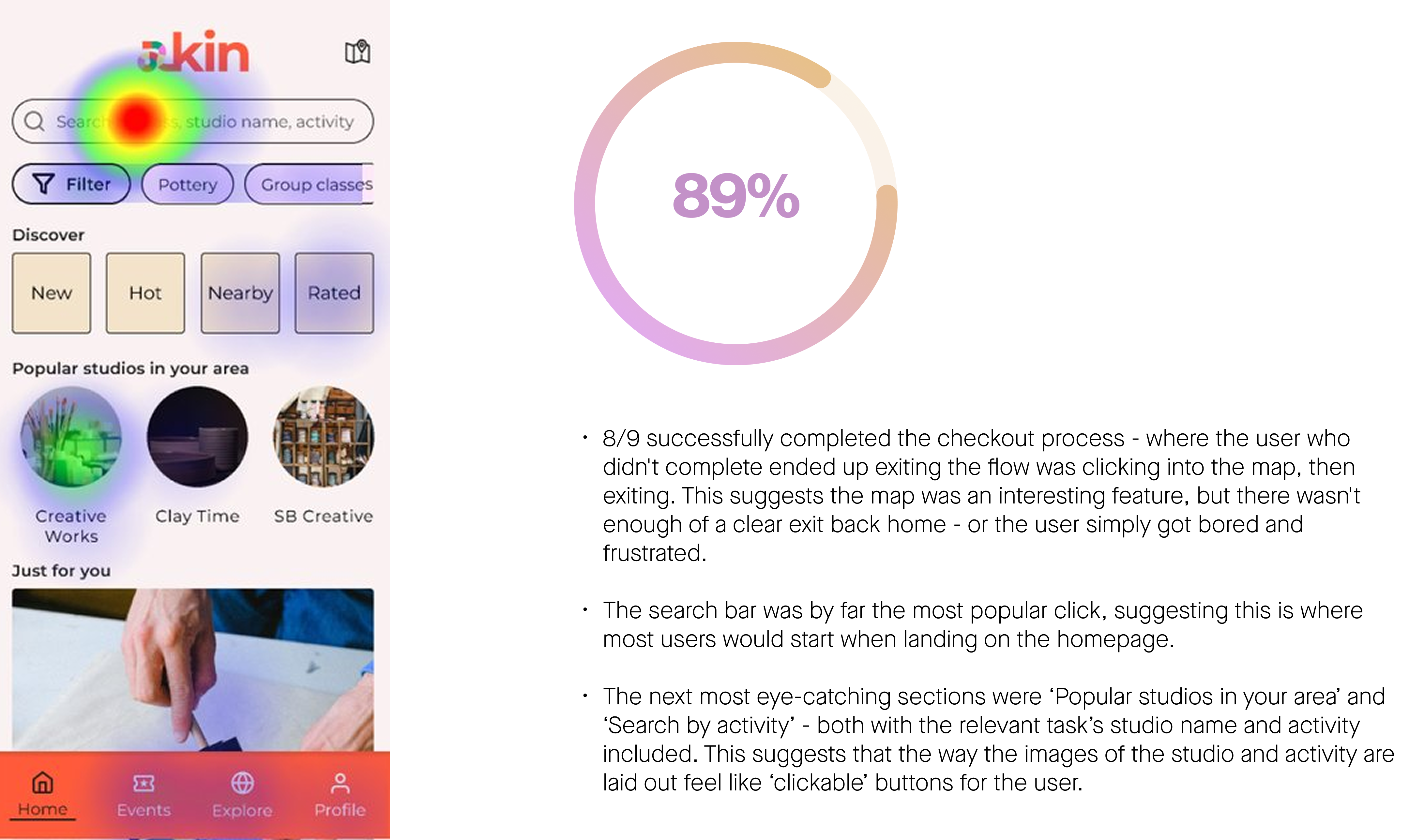
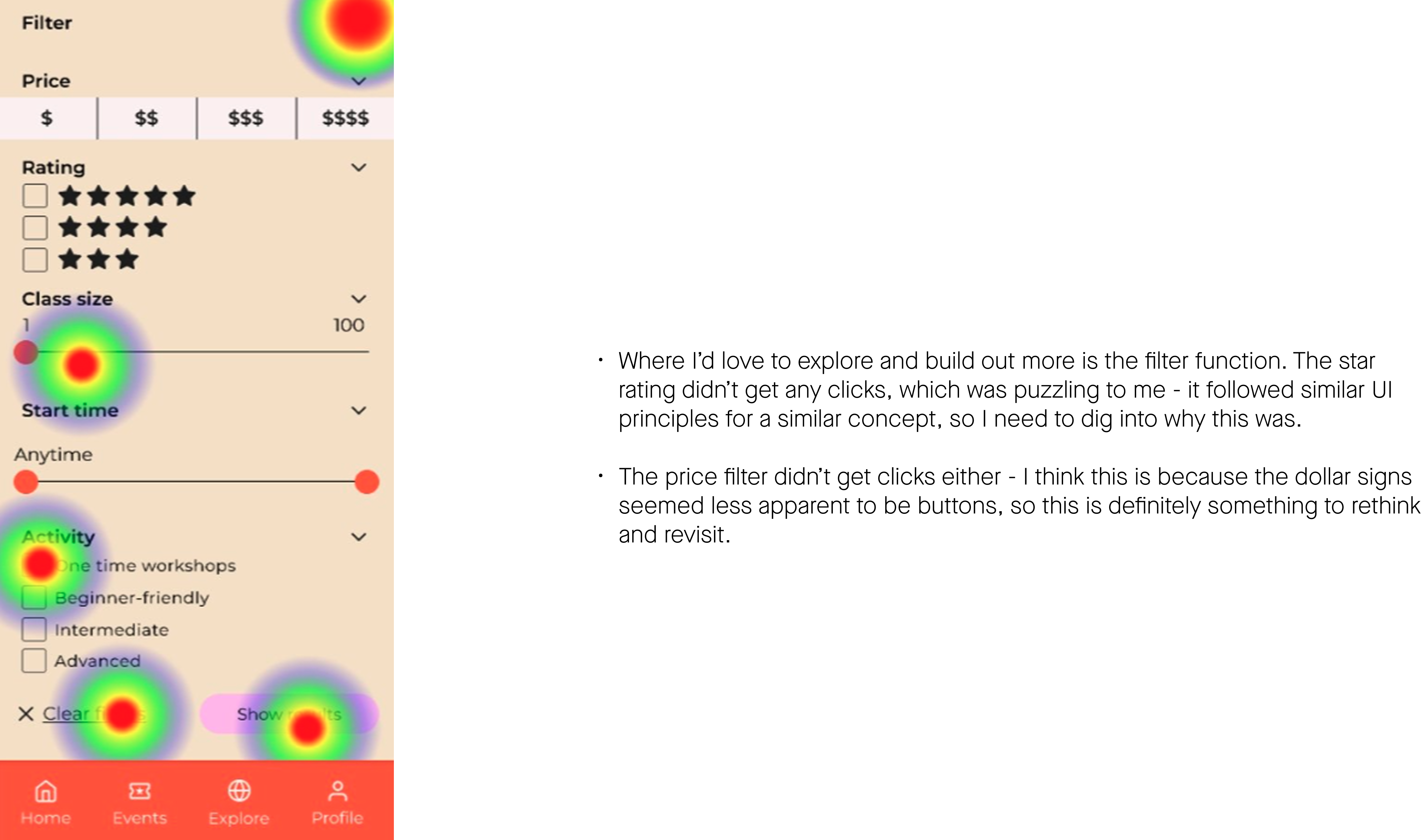
For version 2, I focused on fixing mainly text, sizing, and spacing issues. It was at this point in discussions and testing that the need for a filter on the homepage came up, and that was included in this round of iterations. We also focused heavily on accessibility, and ensured the app met WCAG 2.1 AA standards throughout.
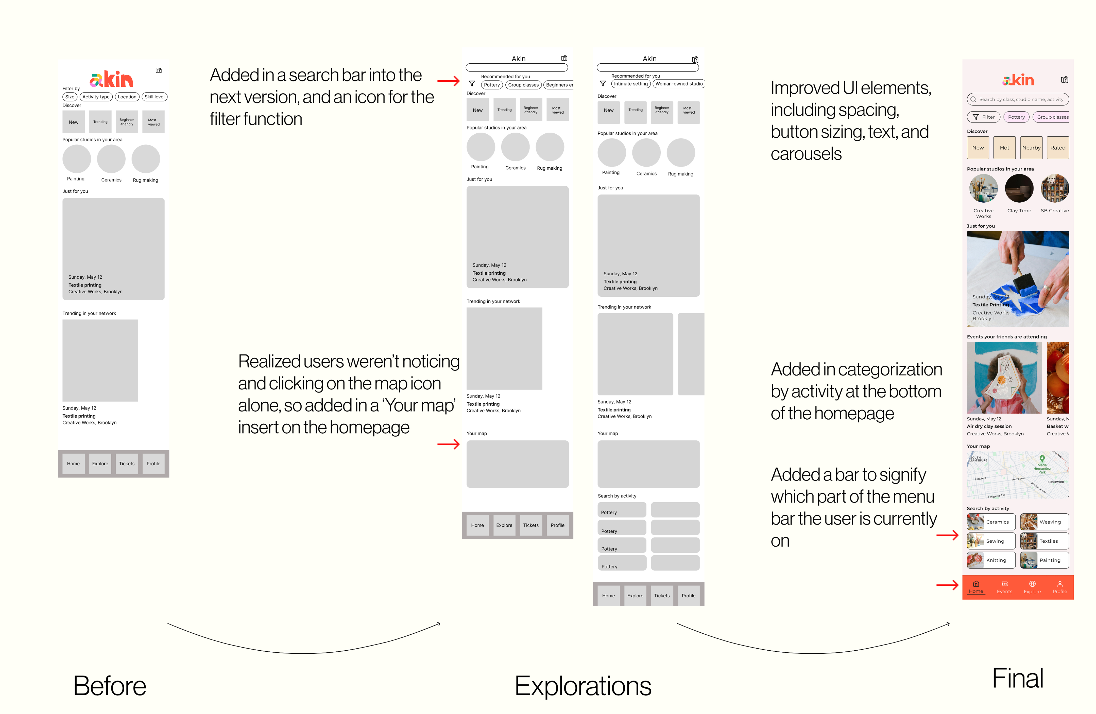
The final prototype covers the full end-to-end experience: signup, class browsing with filters, booking, and community discovery. The design system and prototype were handed off to the development team.
This project spoke to so many of my interests and passions — helping people find peace and passion in creative pursuits, and thinking more about how small business owners and creatives could both be best served. One of my main learnings that became evident through testing is to address how we can marry together brand colors in a way that's not grating, distracting, or signals a lack of professionalism. It's a constant learning for me to not use the brand colors absolutely everywhere.
This was also my first real experience working with a broader product team, and I owe so much to the Product Manager, Engineer, Brand Designer, and Marketing Expert all on this project. I learned the most seeing how business and commercial goals, which I have a background in, need to meet the technical considerations of the frontend and backend build. It was fun brainstorming as a team to see how all these different interests could be met by a few clever tricks and problem-solving.
There's so much for me to iterate on — expanding the map and filter functions are two top priorities. This app hasn't launched yet. I'm sure when it does, it will successfully address pain points in the creative event ecosystem in New York City, and I can't wait to see how we iterate based on user feedback and how we learn to differentiate in a crowded market.